Basecamp03 / 08
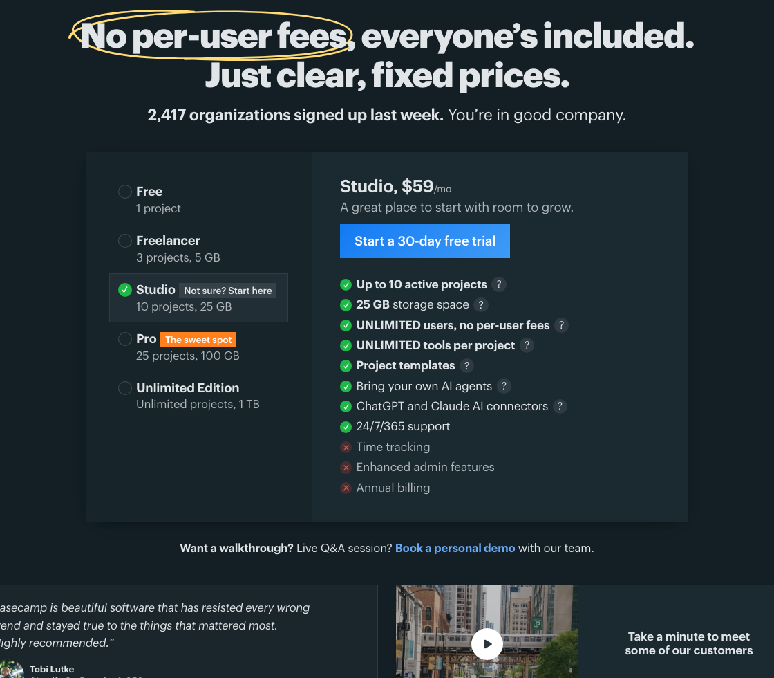
Show every plan's price in one comparison.
 12
12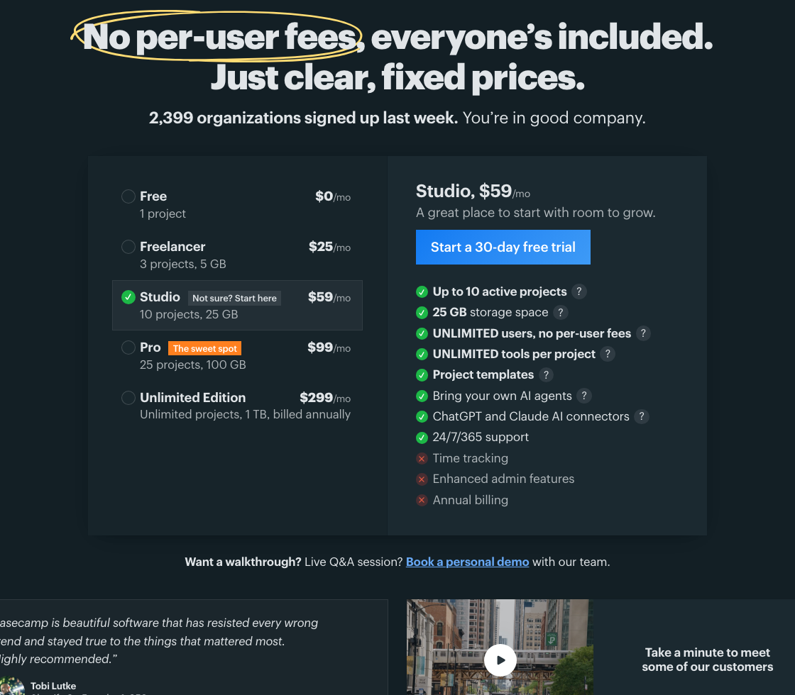 After (proposed)12
$ claude> Work in the repository that serves Basecamp: https://basecamp.com/> Find the actual components, content and styles before editing. Check the current implementation against this dated observation; do not assume file paths.> > Make one change: Show every plan's price in one comparison.> Put every plan's price, project limit and storage in one comparison. A team can weigh the tradeoff without clicking through each plan.> > Design intent:> Comparison works better when consequential values are simultaneously visible. Reducing interaction can make a dense commercial decision easier without adding a pricing wizard.> > What was observed:> The captured pricing page lists five plan names and capacities on one side and the selected Studio details on the other. The fixed-price model is a strength to preserve. Current numbers and included features must come from the live pricing data.> > Where, exactly:> 1. Plan list showing capacities but no prices: Put each plan's price next to its name here, so the list compares plans on its own.> … 21 more lines> … 27 more lines
Independent public example based on captures of basecamp.com. Second Pass is not affiliated with Basecamp or 37signals.